Contact us
3, Avenue Saint Andrews, California
info@fleurdujourflowers.com
Monday - Friday: 10AM - 5PM
Saturday: 10AM - 2PM
Sunday: Closed

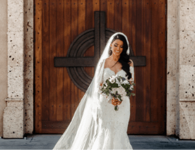
Color guides the first impression of any bouquet. Before a note is read or a ribbon is untied, the palette sets the tone and the message. A thoughtful arrangement does not rely only on the choice of stems; it relies on a careful selection of hues that support the occasion, the setting, and the person who will receive the flowers. Florists treat color as an essential design tool because it shapes mood, meaning, and memory in a quiet yet reliable way. Fleur Du Jour always follows this approach.
Step into a florist shop on a busy morning and listen. One guest needs “something brave for a big presentation”. Another needs “gentle flowers for a tough week”. The palette begins there.
Color is not simply an eye-appealing element at the end. It is the first decision when you buy flowers.
Customers who select same day flower delivery value timing. There is little room for long revisions, so the colors must carry the message without confusion. Reliable pairings help the bouquet deliver the feeling quickly and gently.
Consider these practical guides that many clients appreciate:
The sender may have only a short call or a brief note. A well-chosen palette protects the intention and ensures the recipient reads the bouquet in the spirit intended.
People who search for a “flower shop near me” usually want local guidance that is direct and helpful. A brief conversation with a florist can make color selection easier. These questions lead to a clear plan:
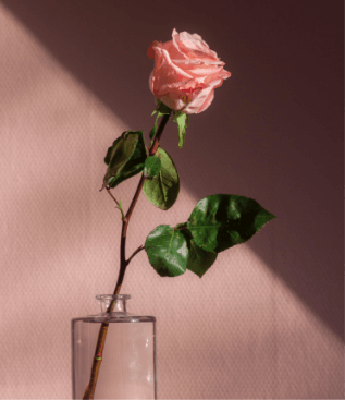
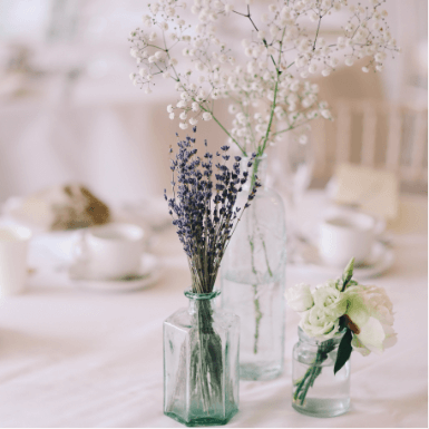
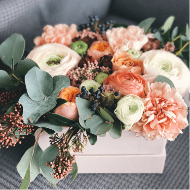
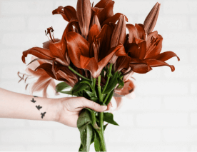
General guides are useful, but context matters. Pastels welcome guests and soothe quiet spaces. Bright colors lift lively rooms and public celebrations. Jewel tones carry an evening character and photograph well. Soft neutrals support mixed palettes and make the design restful on the eye.
Many people who search for flowers in Lancaster want arrangements that suit local tastes and the seasonal mood. Harmony matters because it helps the bouquet feel comfortable at home, at work, and in community venues. A balanced palette never strains for attention; it holds presence with ease.
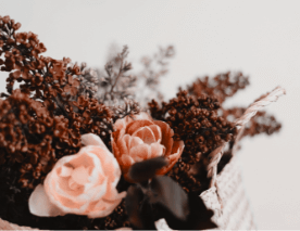
A simple method keeps harmony dependable: choose a leading color that suits the purpose and add a supportive partner flower that softens or strengthens the message. Use foliage to anchor the pair. This approach prevents visual noise, helps the design age gracefully over the week, and ensures it looks good both in person and in photographs.
A Lancaster florist personalizes color by beginning with the person, not the product. The florist asks who will receive the bouquet, what moment is being marked, and what the first glance should say. With those answers, the florist tunes three core elements:
Personalization can be a small shift that makes all the difference:
These refinements turn a group of stems into a thoughtful gesture.
Many clients prefer and search for “local flower shops near me” because local florists understand how colors are read in nearby spaces and gatherings. They know which venues brighten under warm palettes and which offices lean toward calm ranges. They also know how certain combinations feel in different lighting, from daylight at a window to low evening light in a dining room.
A short checklist guides the final decision and keeps communication honest:
When these points are clear, the palette becomes a precise voice. The bouquet steps in, supports the moment, and speaks with clarity and grace.
Clients often ask for simple, dependable direction. The following notes summarize practice at many service counters:
These guides are starting points, not fixed rules. The conversation with your florist brings them to life for your specific situation.
Color is the foundation of floral design. It directs the first impression, supports the tone of the occasion, and leaves a memory that remains when the flowers are gone. When the palette is chosen with care, the arrangement does not have to insist on itself. It stands with quiet confidence, respects its setting, and reaches the recipient with the meaning the sender intended. That is the practical value of color psychology in flowers.